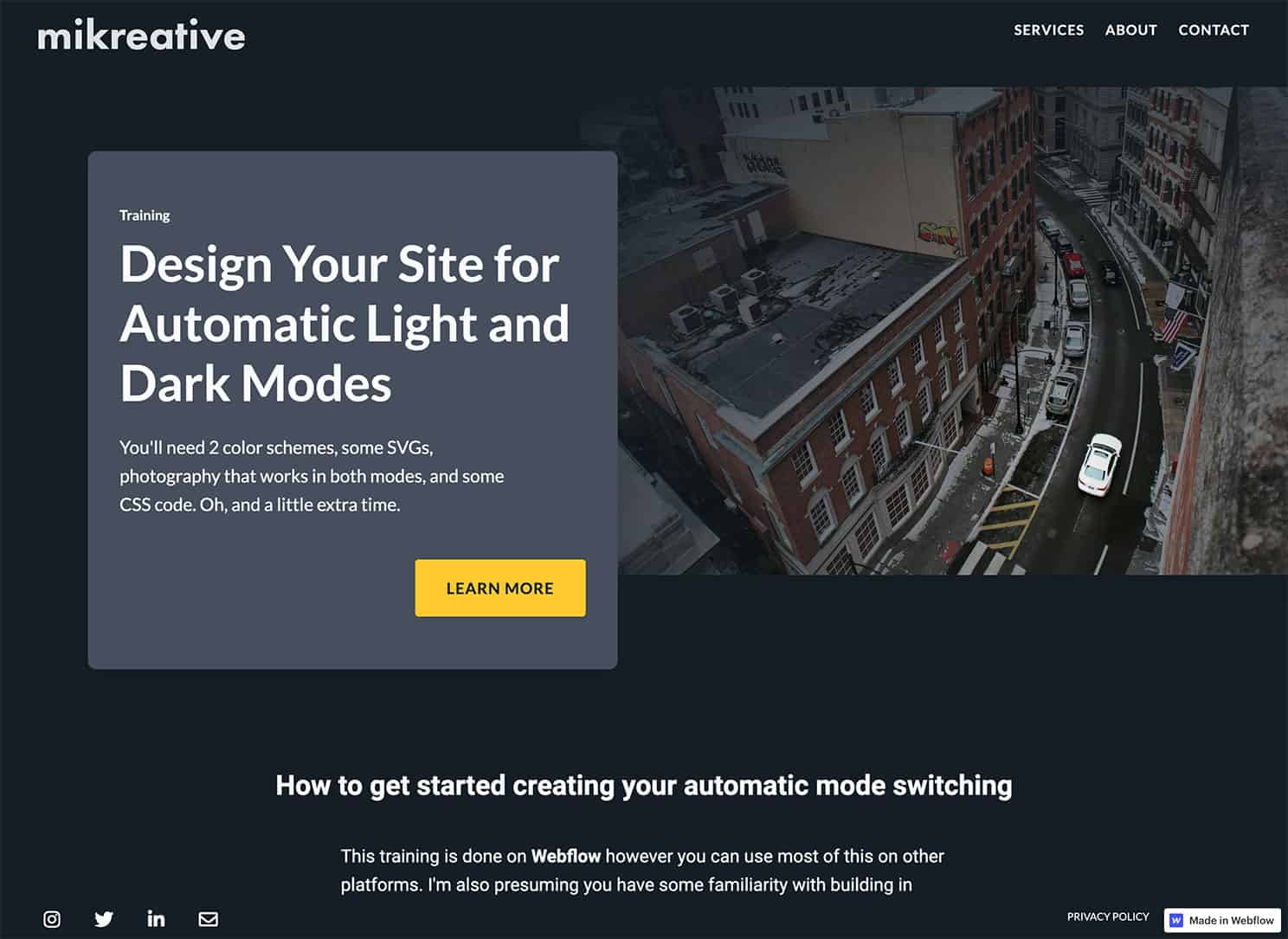
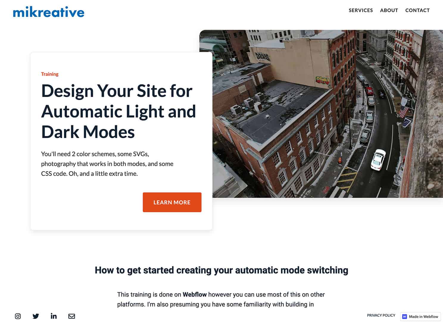
Dark Mode or Light? How about both?
As a user experience designer, I use the Jobs-to-be-done Theory to guide my work. This helps to identify the customer's needs and the steps or jobs that the customer does to fulfill their need. The question then becomes; is what I'm designing part of the core functional job, the related job, or emotional job? Or is it a distraction? Or is it something my client really wants?
Giving the customer a switch to choose between dark mode or light mode is nice but is it adding to the burden of the job? Dark mode or light mode is one of those jobs you can get out of the way using some low-code to make the switch automatically. The customer might not notice however it'll add to their satisfaction score of your business.
Where it Began for Me
I was inspired by a Facebook Webflow Group post by Ezra van den Broek and Nelson's YouTube video about allowing the user to switch from light mode to dark mode. With a bit of low coding, I can automatically present my test site in light or dark mode. This is based on the user's system preferences being set to light or dark mode. This post is done using Webflow. I've tested this on, and it works in, Chrome, Firefox, Safari, Edge, and Opera on Windows, macOS, and iOS13. I have not tested on Android.
Started with a Default Scheme
You can set 3 different values - custom, light, and dark using media queries. The specific query is the 'prefers-color-scheme'. There is not a browser's 'theme' preference. It took me a little while to figure that one out.
There are a couple of ways you can go with this. You can set 2 very different color schemes and layouts based on mode, or you can leave the structure alone and change the colors. With the latter, you maintain consistency with the user's who have set their color preferences to shift from light mode to dark at night. My approach with this test was to retain the layout and tweak the colors.
In Webflow, I created my light scheme as the default. From here I used Jose Ocando's HTML embed trick to style the media queries. I used only the light and dark mode queries. With the default and light being essentially the same, I saw no reason to include the no preference mode. Once the styling was done, I moved it to the Custom Code section of the site settings. From there, I deleted the embed. I should've done my accessibility testing before doing that since it didn't pass color contrast. More on accessibility testing in another post - the linked post was done using WordPress as a platform; I'll do another one using Webflow shortly.
Added the Dark Mode Scheme
There is a great post by Briandito Priambodo on what to think about when going from one mode to the other. You can make it as easy or complicated as you'd like as long as your user is able to accomplish the 'job-to-be-done'. For my test site, I've made it pretty simple to make sure I'm aware of what happens when going from one mode to the other.
Below is the CSS I used to accomplish this. The classes I named were easy to target. To find the classes I didn't name but needed to target, I used the inspector in Chrome to find them.
Within the <style> tags I put
</style>
Tweaking
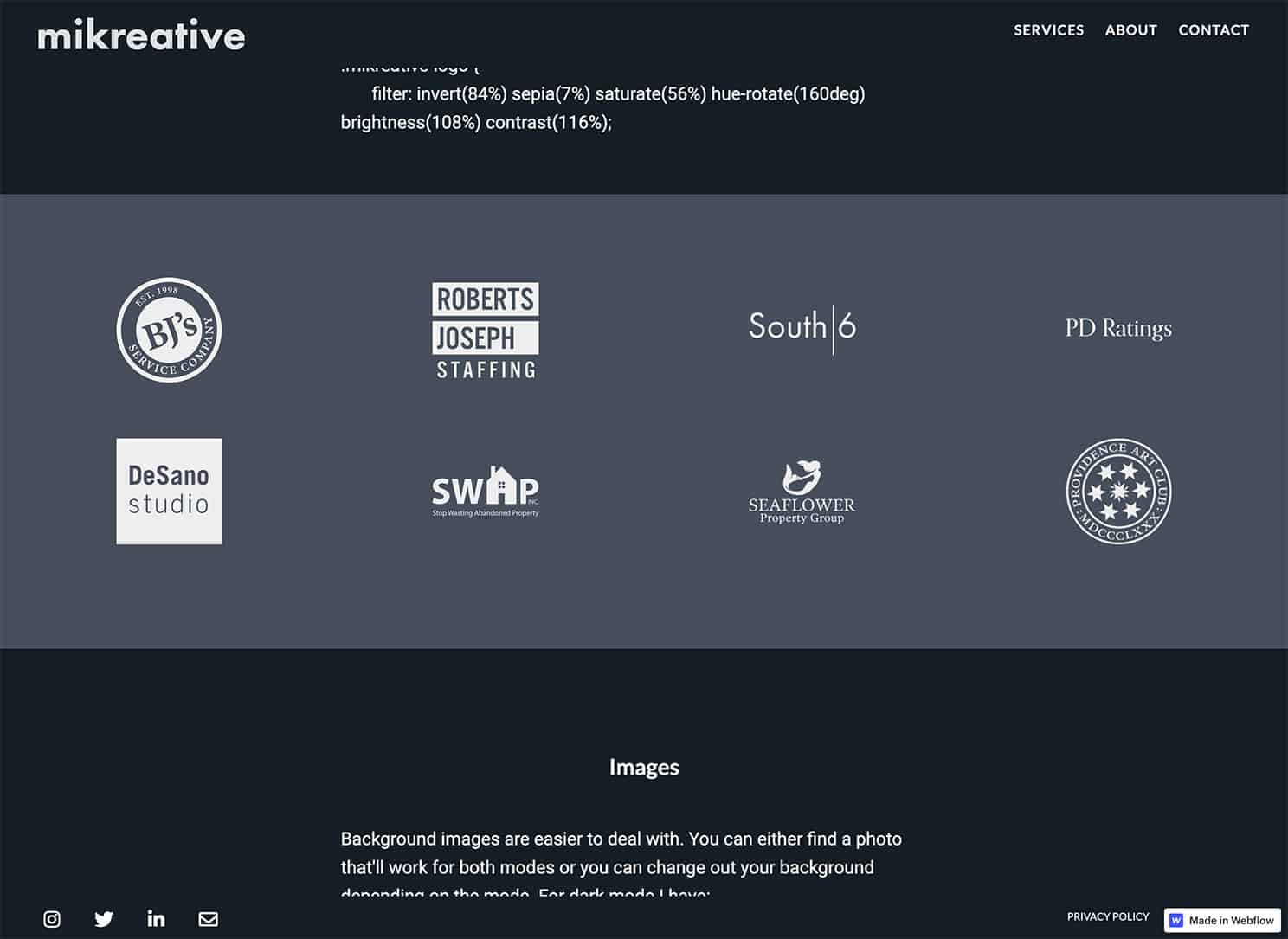
I was using PNGs for my logos and icons but changed all of those to SVGs so I can use the CSS filter generator to change the logos and icons to whatever color my design calls for.
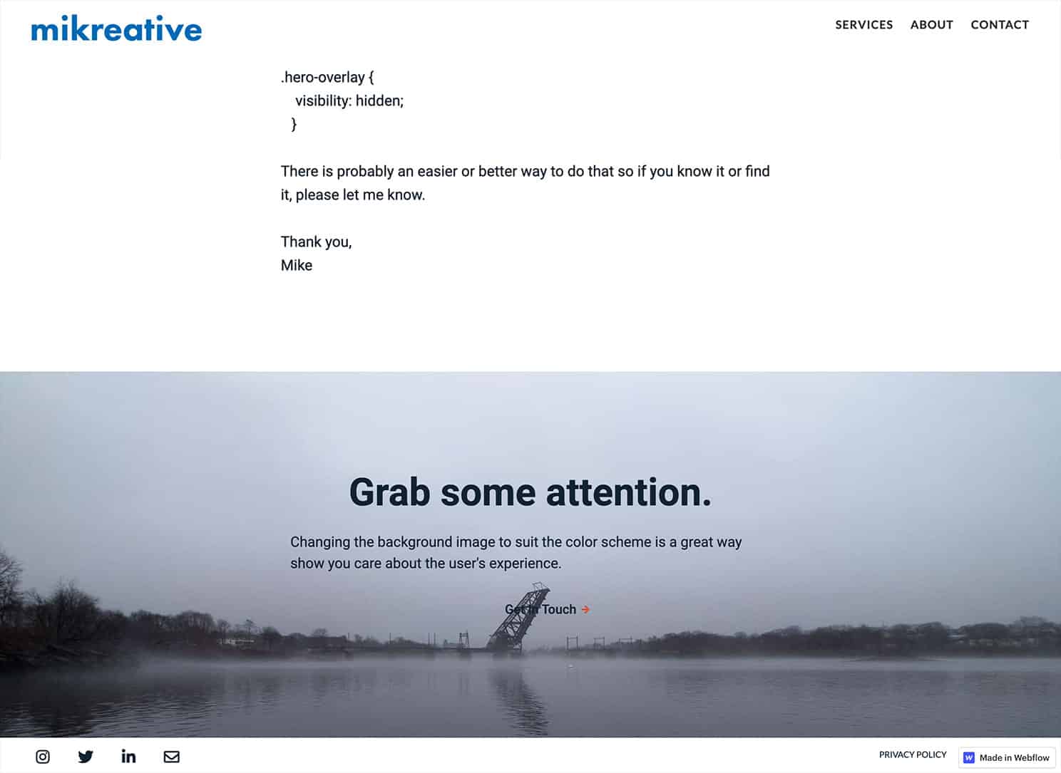
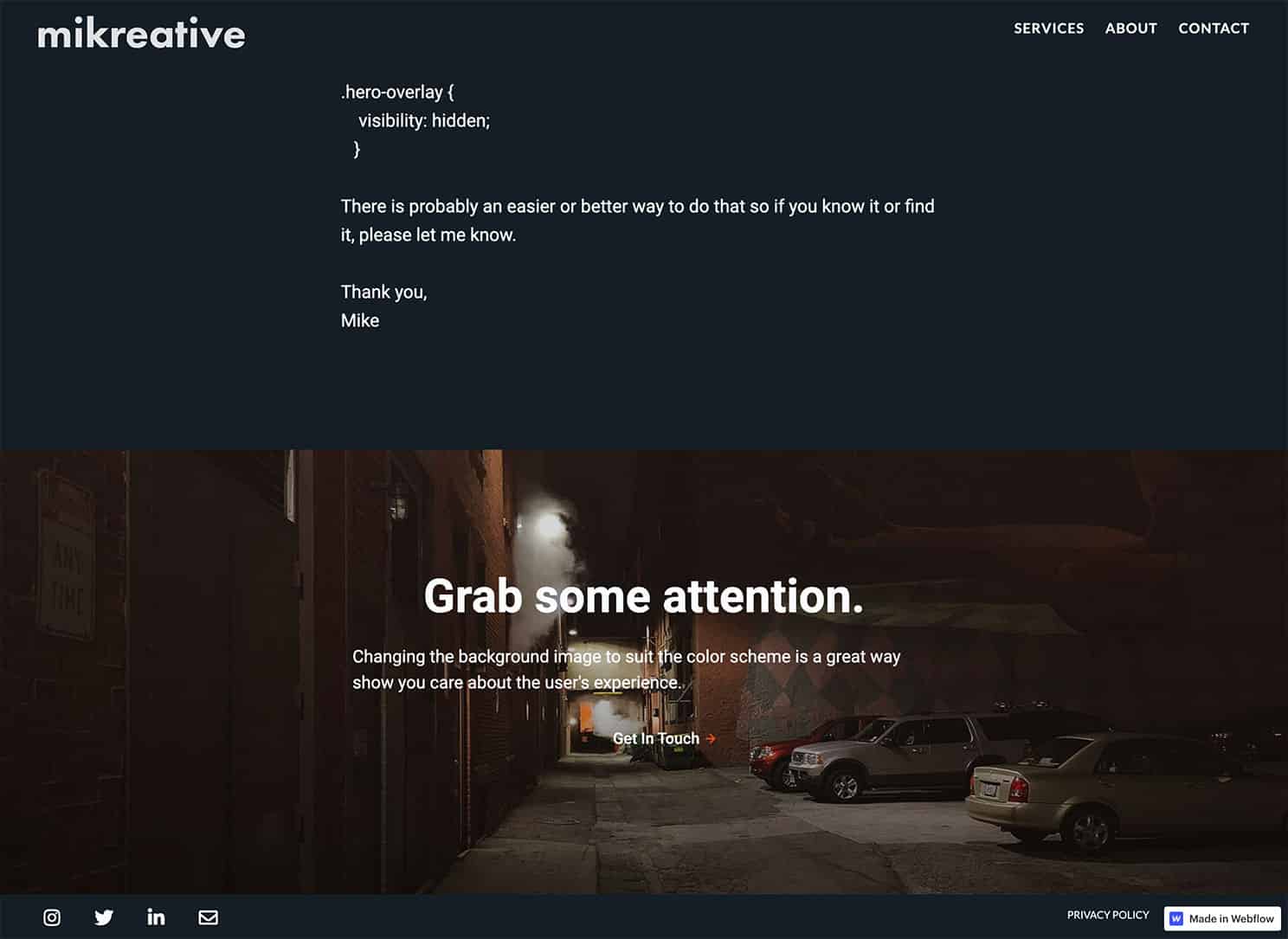
My hero image was darkish already so the only thing I did there was to add an overlay so I can add some vignetting to it.
The last image on the hompage I changed out completely. The light mode one was fine but I decided a darker color sceen would work better.
I still have some tweaking to do however I'm excited about the possibilities. I've started to add this to my live site beginning with the blog posts. I'll also be offering this option to my clients at an additional charge. After all, it is essential for 2 different looks.
Check out the results at my test site or on this page.
I'd love to hear what you've discovered playing around with 'prefers-color-scheme'. Get in touch on your platform of choice.


