Dark mode or light mode: the Bubble.io edition

My first foray into forcing my Bubble.io application to automatically switch from a light mode design to a dark mode design was horrific. I attempted to use HTML elements which would crash the Bubble designer. Nevertheless, I was able to make, at least, a test version. Months on I've learned so much more.
One of those was learning about Julien Allard's Classify plugin. Coming from years of previous experience with WordPress plugins I will try several ways of doing something natively before turning to plugins. This one, I have to say, so far, has been the simplest but most useful plugin.
By using a combination of the native classes and the Classify plugin I'm able to create dark and light designs that respect the user's device settings. Here is how I've done it.
The setup
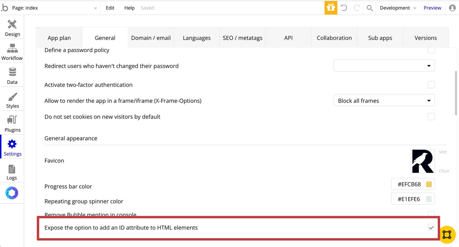
1. Under Settings go to General then to the section with the Favicon in it. It's called General appearance however it is easier to look for the Favicon. Check the checkbox for Expose the option to add an ID attribute to HTML elements.
2. Add the Classify plugin. The best thing about this plugin is you don't have to do anything else. No dragging it onto the page. It works as it is.

3. Decide on your colors. In the example I'm using I created the light version which has some cross-over colors. For instance, my primary buttons are yellow which works well in light or dark modes. My whites are off-white and my blacks are off-black or purple.
The process
This really is my process. I tend to design the initial page, make sure everything is working then convert the elements to reusables. Ultimately the styles I've created will live in a reusable HTML element. This will then get put into a reusable header. If it is a one page app then I'll put the code in the Page HTML Header section of the appearance tab. In the example below I popped an HTML element on the page since I have several pages for this app.
Since this post is about the dark and light mode I'll be using a design I've already created in the light version.
Native tags and classes
When I first started learning Bubble.io I thought that naming the styles would be the class name. Boy was I wrong. Take a look at the image below. This is from a Saas product that I'm building in my spare time. This is from the browser's dev tools. I right-clicked on the page and went to Inspect.
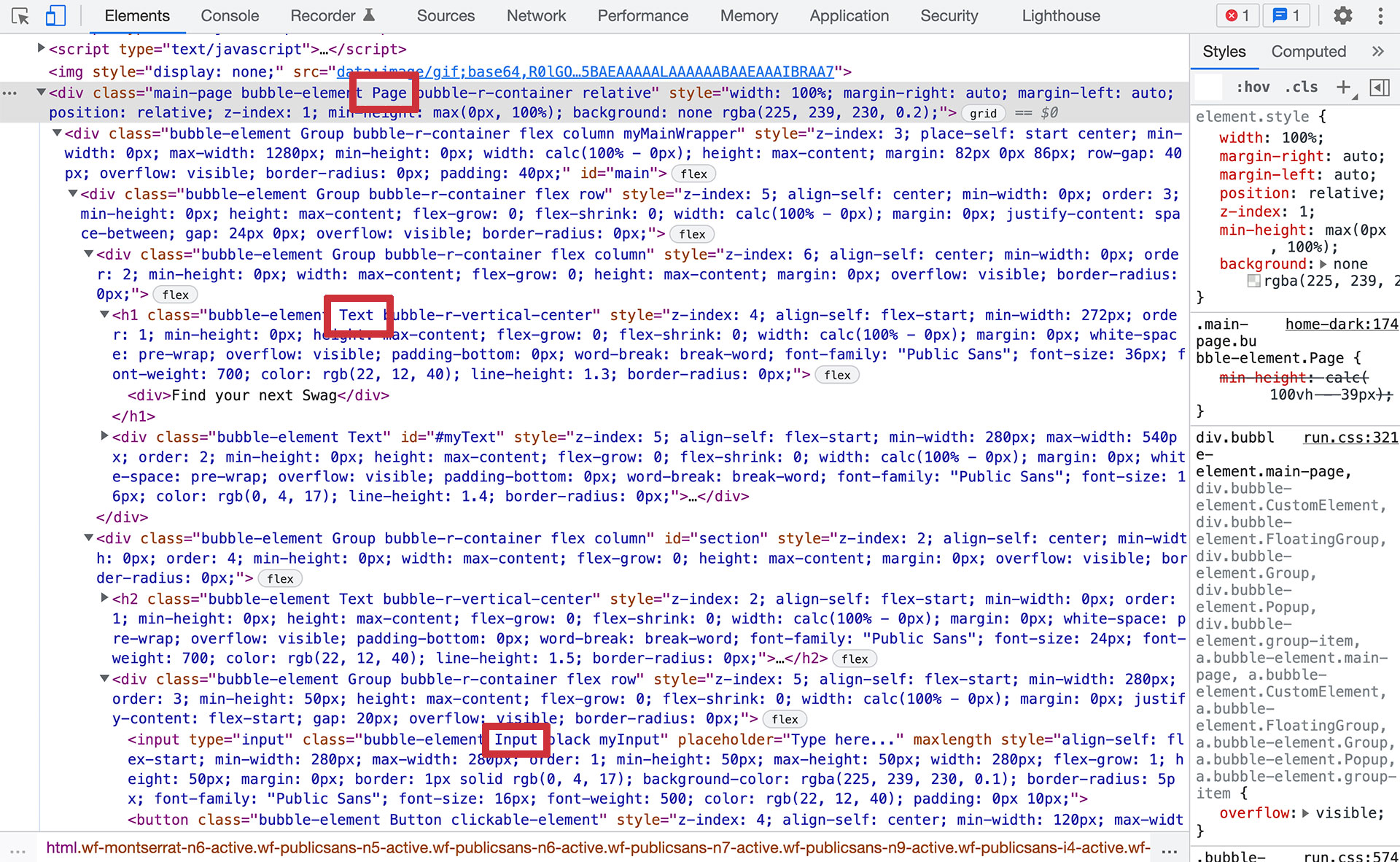
You can see there are a lot of divs, an h1, a couple of imgs, an input or 2, and a couple of buttons. It looks like Bubble uses a combination of classes and inline styles for the same element. To keep it simple we are going to use some of the native HTML tags along with some of Bubble's native classes.
Those are:
- body (HTML)
- Page (Bubble)
- Text (Bubble)
- Input (Bubble)
- It is also possible to use Group (Bubble) depending on your scheme.
Starter Style
Here is what we'll be starting with. If you designed the light mode version in Bubble most of your work will be under dark mode. You probably don't need the reference to light mode in there but I like to have it just in case.
Let's go as far as we can with the HTML tags and native classes with the starter code (you'll have to add the style tags;
Classify plugin
Let's now take care of what we aren't able to do otherwise.
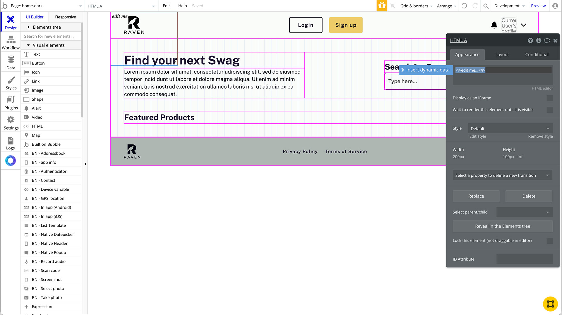
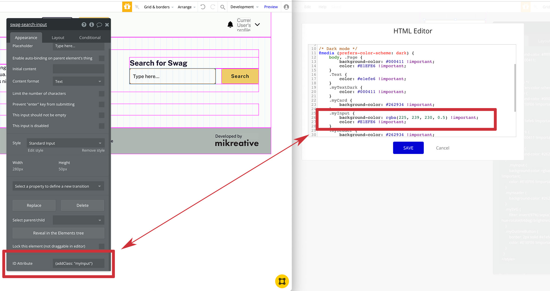
In the ID Attribute of the input let's add the Classify command and name our style. We'll then go to the HTML editor and add the class along with the styling.
Wrapping up
Now that we've tested it and we are happy everything shows up in both dark and light we can now make it reusable. Right click on the html element and Convert into a resusable. This will save you hours if you ever need to make updates to the color schemes.
Here is the complete code for this example;
Resources
Easy to understand CSS - Mozilla
Thank you!


